Writing is a huge hang up for most of us. Very few of us actually like our own handwriting, and are very self critical. It is memory keeping, however, and the way we write says something about us, and captures it forever.
 To get around this, there are many different tools available. A computer/ printer is a fabulous source. Play with different fonts and sizes, even within your body of text....mix it all up as it creates great interest.
You could record important information, journal events (diary style)....or what about searching the internet for appropriate poems, quotes, word definitions etc. Endless possibilities !!!!
To get around this, there are many different tools available. A computer/ printer is a fabulous source. Play with different fonts and sizes, even within your body of text....mix it all up as it creates great interest.
You could record important information, journal events (diary style)....or what about searching the internet for appropriate poems, quotes, word definitions etc. Endless possibilities !!!!
And it's perfect for title lettering...All you have to do is cut it out, or transfer to your chosen paper/cardstock, and save the print out for templates.

 You could use your stamps. Letters and numbers are particularly useful.

 It's definitely worth investing in a die cutting machine. These are a particularly useful tool if you intend to do lots of scrapbooking.
But don't underestimate the power of your own handwriting.
You can always print, as in the example on the left. It's nothing special, in fact it's rather scruffy.........
It's definitely worth investing in a die cutting machine. These are a particularly useful tool if you intend to do lots of scrapbooking.
But don't underestimate the power of your own handwriting.
You can always print, as in the example on the left. It's nothing special, in fact it's rather scruffy.........
........but.........
.......add a few 'dots' to the junctions/ends of each letter, and it's totally transformed.
Have fun,
Christine
 You
can use any geometric shapes to create your scrapbook backgrounds or
accents. I am going to focus on squares for the majority of this weeks
examples, simply because they are the easiest to cut, but by no means be limited, as an abundance of different effects can be created using a variety of geometric shapes, and even mixing them, as we did last week to create the sun. The top page used a small square punch to create a mosaic tile effect in a variety of blue papers, both patterned and plain. I used these to create a border, accent the corners of the photos and punch out the title lettering. Although the odd letters, purely because of their shape, are more rectangular rather than square. Don't be afraid to type your own things up on the computer and print out - letters, poems, quotes etc.
You
can use any geometric shapes to create your scrapbook backgrounds or
accents. I am going to focus on squares for the majority of this weeks
examples, simply because they are the easiest to cut, but by no means be limited, as an abundance of different effects can be created using a variety of geometric shapes, and even mixing them, as we did last week to create the sun. The top page used a small square punch to create a mosaic tile effect in a variety of blue papers, both patterned and plain. I used these to create a border, accent the corners of the photos and punch out the title lettering. Although the odd letters, purely because of their shape, are more rectangular rather than square. Don't be afraid to type your own things up on the computer and print out - letters, poems, quotes etc.
 Sometimes less is more, and you don't need to add much to complete your page. I used white squares with red lettering to mimic the 'L' plates...now torn up in the bottom corner. The writing at the top are quotes I found on the internet, entitled 'Some Useful Driving Tips'.
For this particular page, I added the squares to fill in some of the blank spaces on the background sheet. The top one done as a frame, placed at a jaunty angle and with some stamping in the centre, and the lower trio with button accents. In fact this is a perfect example where there is no additional background, just the purity of the lovely water marked paper.
For this page, I used larger squares to create an L shaped border along two of the sides, which allowed me the space to add appropriate words...again, no theme to the background....frames around the photographs and a few embellishments and stick on phrases is all that the photos needed.
Sometimes, you have only one or two photographs to showcase on a single page, and this is where you need to fill in some of the gaps. Geometric shapes are a great way to do this.
Last week, the double page spread I shared, used punched circles, that were then stamped with circular letter stamps to produce the title. This is another way of using circles. When you select the papers you are using, cut a variety of different sided circles, and look for circular embellishments. Overlap them in varying sizes, position so they go off the page, then trim to the edge, substitute them for the letter 'O' in the wording, use brads, buttons, thread through them....have fun. The possibilities are endless. Ovals would work in the same way, but then again, squares and rectangles in varying sizes could also be overlapped to create your background, instead of a theme.
What about hexagons? You could do some patchwork on your background, or triangles - some pointing up and others down, to create a running border or a whole background sheet. Some photos need very little fuss, as they speak volumes, where as others require enhancing to make your eyes understand the 'story'.
Have fun
Christine
Sometimes less is more, and you don't need to add much to complete your page. I used white squares with red lettering to mimic the 'L' plates...now torn up in the bottom corner. The writing at the top are quotes I found on the internet, entitled 'Some Useful Driving Tips'.
For this particular page, I added the squares to fill in some of the blank spaces on the background sheet. The top one done as a frame, placed at a jaunty angle and with some stamping in the centre, and the lower trio with button accents. In fact this is a perfect example where there is no additional background, just the purity of the lovely water marked paper.
For this page, I used larger squares to create an L shaped border along two of the sides, which allowed me the space to add appropriate words...again, no theme to the background....frames around the photographs and a few embellishments and stick on phrases is all that the photos needed.
Sometimes, you have only one or two photographs to showcase on a single page, and this is where you need to fill in some of the gaps. Geometric shapes are a great way to do this.
Last week, the double page spread I shared, used punched circles, that were then stamped with circular letter stamps to produce the title. This is another way of using circles. When you select the papers you are using, cut a variety of different sided circles, and look for circular embellishments. Overlap them in varying sizes, position so they go off the page, then trim to the edge, substitute them for the letter 'O' in the wording, use brads, buttons, thread through them....have fun. The possibilities are endless. Ovals would work in the same way, but then again, squares and rectangles in varying sizes could also be overlapped to create your background, instead of a theme.
What about hexagons? You could do some patchwork on your background, or triangles - some pointing up and others down, to create a running border or a whole background sheet. Some photos need very little fuss, as they speak volumes, where as others require enhancing to make your eyes understand the 'story'.
Have fun
Christine
 There are many ways of showcasing your photographs, one of which is to 'theme' your backgrounds. To me a holiday would always involve the sun, sea and sand, although I appreciate that there are those that like the 'white stuff' (arrrrggghhhhhh !!!!) and would class skiing as an enjoyable pastime - personally it would be my worst nightmare.
But for the purpose of this exercise, let's stick to the gorgeous yellow globe in the sky :) For this particular page, I chose a neutral background. When selecting papers, I either try to choose colours that are already in the photographs, or neutral tones that will allow them to simply be a background. Using some plain yellow, I drew around a dinner plate and made some elongated triangles to represent the suns rays. I cut a wavy background for the sand (a slightly lighter shade than the main sheet of 12 x 12), and a more pronounced border to represent the waves. None of this has to be a work of art, as it is your background on which you are going to add your photos and journalling. As I mentioned last week, there are very few photographs of myself when I was younger, so this one page covers four separate years. I labelled, where appropriate, the particular years, information which fortunately was on the back of the photographs. I used a 1/4" hole punch to add 'studs' in the corners of the photographs (using the same yellow as the sun), added the title on the wave border, a few purchased embellishments and a journal tag. So if you aren't sure where to begin with a holiday themed page, perhaps you can give this design a go.
Below are a few more holiday themed pages.
There are many ways of showcasing your photographs, one of which is to 'theme' your backgrounds. To me a holiday would always involve the sun, sea and sand, although I appreciate that there are those that like the 'white stuff' (arrrrggghhhhhh !!!!) and would class skiing as an enjoyable pastime - personally it would be my worst nightmare.
But for the purpose of this exercise, let's stick to the gorgeous yellow globe in the sky :) For this particular page, I chose a neutral background. When selecting papers, I either try to choose colours that are already in the photographs, or neutral tones that will allow them to simply be a background. Using some plain yellow, I drew around a dinner plate and made some elongated triangles to represent the suns rays. I cut a wavy background for the sand (a slightly lighter shade than the main sheet of 12 x 12), and a more pronounced border to represent the waves. None of this has to be a work of art, as it is your background on which you are going to add your photos and journalling. As I mentioned last week, there are very few photographs of myself when I was younger, so this one page covers four separate years. I labelled, where appropriate, the particular years, information which fortunately was on the back of the photographs. I used a 1/4" hole punch to add 'studs' in the corners of the photographs (using the same yellow as the sun), added the title on the wave border, a few purchased embellishments and a journal tag. So if you aren't sure where to begin with a holiday themed page, perhaps you can give this design a go.
Below are a few more holiday themed pages.
 This is a double paged spread, again using a neutral background (dark cream), picking out the turquoise of the swimming pool and some candy stripes for contrast (otherwise the photos would simply merge into the background and get lost. If you notice, I have done the opposite with the turquoise and the candy striped pieces. If I have placed one horizontal on one page, I have placed that same piece vertically on the opposite page. Thus creating a frame - two opposite corners. I have accented with a darker brown - tied tissue paper for bows, and wetted and torn tissue paper to edge the candy stripes. A title, some journal and other embellishment and accents...et voila !!
 Now for this page, I took my colour scheme from the red hat and the swimming pool. There are some fabulous scrapbook stickers that can add to your photographs rather than detract from them. The centre photo on the left has a splash picture with the wording 'cooling off!', which perfectly sums up this particular photo.
 This one has a pre-printed border top and bottom, of cute little divers, as that was the particular purpose of this trip. The remainder of the background was a mid blue page with curved yellow pieces placed in opposite corners, under the top/bottom borders. Now if I wasn't pointing this out, you wouldn't have noticed, which is why I said at the beginning, don't get hung up on it being a work of art. It does add to the page, but it isn't the focal point, that's for your photos and journalling. A few die cut fish with wobbly eyes, diving gear and lettering, some punched white circles, with light blue pen to make them look like bubbles, and the photos matted onto the various papers used, so that it all pulls together.
Stop by next week for geometric shapes instead of a themed background.
Christine
This one has a pre-printed border top and bottom, of cute little divers, as that was the particular purpose of this trip. The remainder of the background was a mid blue page with curved yellow pieces placed in opposite corners, under the top/bottom borders. Now if I wasn't pointing this out, you wouldn't have noticed, which is why I said at the beginning, don't get hung up on it being a work of art. It does add to the page, but it isn't the focal point, that's for your photos and journalling. A few die cut fish with wobbly eyes, diving gear and lettering, some punched white circles, with light blue pen to make them look like bubbles, and the photos matted onto the various papers used, so that it all pulls together.
Stop by next week for geometric shapes instead of a themed background.
Christine
I
do not profess to be a scrapbooking expert, but it is something I love
to do. Recently I have been helping a lady embark on this fabulous pastime, and it struck me that what I find relatively easy, is not
necessarily so for others. Whilst I don't want to teach anyone to 'suck
eggs', I did feel that some of you reading my blog may be grateful for a
few basic pointers....so here goes !!
I
think perhaps the first hurdle, is having the courage to
'crop' - cut off all the unnecessary bits of a photo that will detract
from the story you are telling. After all, this isn't merely an
exercise in sticking photos in an album...you can do that with little
effort....it is about telling a story. Whilst those present in the photograph may know the story, others, getting a sneak peek, aren't privvy to what story it tells. Plus, our memories fade as time goes on, and this is a fabulous way of capturing those precious memories that we hold dear. I have been asked on many occasions why I am doing a scrapbook for myself. Well one of the answers is that if, heaven forbid, I should develop dementia in old age, I have a tool to help unlock some of those memories, and give those sitting with me, something to communicate with.
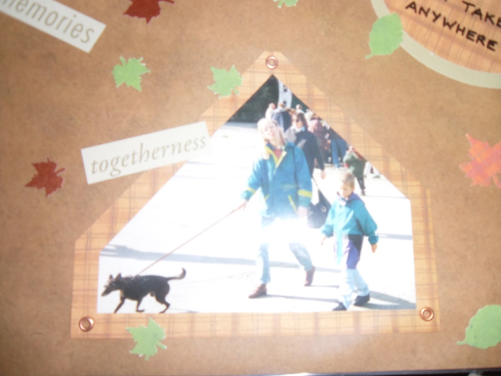
 If there are parts that cannot be cropped, then overlap either other photos or shapes, or a journal tag, to hide unwanted bits.


 Examples of cropping, overlapping with other photos, and using a journal tag to hide part of the photo.
Your second consideration is to think about the purpose of your scrapbooking and ultimately, for whose benefit it is. The story may be a chronological
life story, as I have done, or a specific event you wish to document, for example a wedding. It may be to showcase activities by a group, for example a church, to highlight
all the different activities that take place on a regular basis, and
the scrapbook can then be used to promote the church.
So, now you have the courage to crop, and a purpose for your scrapbooking, how do you truly showcase your photos and tell that all important story? Next week I am going to focus on being more creative with your backgrounds, but to ease you in gently, I thought I would begin with scrapbooking in it's simplest form, by 'presenting' photos, with a 'title' and a little insight into what they are about.
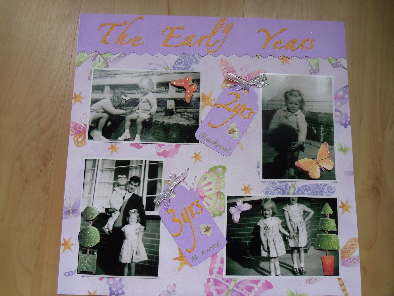
There are very few photos of myself when I was young, as my parents tell me they didn't own a camera. So those that are in existence, are extremely precious indeed. Because of this, I did not want to do too much to them. It may look like I have matted them onto white, but those of you who know of black and white photographs, know they came with a white border to 'frame' them. I love black and white photographs, and tend to favour using them when I make wedding albums, as they look more elegant with an air of mystery about them. Now for this particular page, because they were black and white, I chose a busy, colourful background sheet, and coordinating plain colours for my 'title' (The Early Years) and journal tags. I use the term journal tags loosely, as when I asked my mum about these photographs, as I was obviously too young to remember them, all she could tell me were my approximate age and where I was. As I said earlier, memories fade, which is why it is so important to document them now. I used die cut letters and a few bought, archival safe embellishments to add some dimension to the page. It is important to use acid and lignin free products when you are scrapbooking. The majority of papers are safe these days, but adhesives and inks may not be, so unless if specifically says that it is archival safe/acid & lignin free, them assume it isn't. It would be a travesty to go to a great effort, only to find a few years down the line that your photographs have started yellowing and/or cracking as a result of using inappropriate products. There are a wealth of 'safe' products on the market, which you will find with ease if you search the internet.
 So dig out those photographs that you hold dear and let's get going. Next week I am going to focus on 'holidays', so get those photos ready for a simple but creative background.
Christine
I am frequently asked to teach this technique, and I have to admit, it is one of my favourites.
This time, I decided to show you some comparisons between different colouring mediums - mainly to demonstrate that you can use whatever you have got in your craft stash.
 You will however, need a clear embossing pad e.g. Versamark or Perfect Medium, either a clear or a white embossing powder, and a heat tool. A hairdryer will not work as it will blow the powder away. A heatgun (the type for burning paint off wood) will work, but be careful not to scorch your card.
You will also need some busy background stamps.... which you might have to make several impressions, to cover the area. The one on the left (and above) are the Kaisercraft Texture stamps and are very inexpensive.
You will however, need a clear embossing pad e.g. Versamark or Perfect Medium, either a clear or a white embossing powder, and a heat tool. A hairdryer will not work as it will blow the powder away. A heatgun (the type for burning paint off wood) will work, but be careful not to scorch your card.
You will also need some busy background stamps.... which you might have to make several impressions, to cover the area. The one on the left (and above) are the Kaisercraft Texture stamps and are very inexpensive.
 I made my tags from some rectangles of card. This first example uses Distress inks (as I have shown you in the past). You could use pigment inks (sponge pads) if you don't have the Distress ones, but be careful that you don't add too much all in one go, otherwise you will get lines and streaks where you don't want them, that won't blend, however hard you try. It is much better to gradually build up your depth of colour.
So this one is using Distress inks - Barn door, Spiced Marmalade and Mustard Seed.
I made my tags from some rectangles of card. This first example uses Distress inks (as I have shown you in the past). You could use pigment inks (sponge pads) if you don't have the Distress ones, but be careful that you don't add too much all in one go, otherwise you will get lines and streaks where you don't want them, that won't blend, however hard you try. It is much better to gradually build up your depth of colour.
So this one is using Distress inks - Barn door, Spiced Marmalade and Mustard Seed.
 And for this one, I brushed on some Starburst Stains. I have had these for an eternity and haven't used them in years. But as I have said, give whatever you've got a try....nothing to lose by experimenting. These stains are a mixture of water, mica pigment and a dye. You could have a go at mixing your own up.
Here is what it looks like when the stains have been brushed on.

 I also applied acrylics to another tag, using a small amount on a baby wipe, and blending it in.
And for the fourth example, I used spray inks.
When the ink/medium has dried, you will need a clean piece of copier (printer) paper and a hot, dry iron. If you have a steam function, set it to no steam and the hottest heat setting.
I also applied acrylics to another tag, using a small amount on a baby wipe, and blending it in.
And for the fourth example, I used spray inks.
When the ink/medium has dried, you will need a clean piece of copier (printer) paper and a hot, dry iron. If you have a steam function, set it to no steam and the hottest heat setting.
 Place the clean paper over the tag and press down with the iron for a few seconds. If you lift the iron up, you will probably see the embossed image showing through the copier paper. If you can see the whole image, you will have lifted all the embossing off - which is what we are aiming for. If you are using thicker paper, you might have to check the surface of the paper that was touching the tag. If you need to repeat this process, even for a small area where you may have missed, always use a clean piece of paper.....or you might transfer what you've lifted off and mess up your iron.
So....where the embossing powder was, is the area that has resisted the addition of colour, thus remaining in the base white.
I finished this by over stamping in black and embossing a quote in copper. There is scope to embellish further, when I make it into a card.
Place the clean paper over the tag and press down with the iron for a few seconds. If you lift the iron up, you will probably see the embossed image showing through the copier paper. If you can see the whole image, you will have lifted all the embossing off - which is what we are aiming for. If you are using thicker paper, you might have to check the surface of the paper that was touching the tag. If you need to repeat this process, even for a small area where you may have missed, always use a clean piece of paper.....or you might transfer what you've lifted off and mess up your iron.
So....where the embossing powder was, is the area that has resisted the addition of colour, thus remaining in the base white.
I finished this by over stamping in black and embossing a quote in copper. There is scope to embellish further, when I make it into a card.
 Again, I over stamped in black, and a dark green for the flying birds, then embossed some keys in silver. The photo doesn't capture the beautiful shimmering lustre of the mica.
 I stamped some 'foliage' at the bootom in a navy ink, some smaller bubbles in a cerise ink, then stamped and embossed a verse in silver.
And finally... I added some Lavinia stamps in black ink, then embossed a gold fairy and "Fairy Wishes and Angel Kisses"
I stamped some 'foliage' at the bootom in a navy ink, some smaller bubbles in a cerise ink, then stamped and embossed a verse in silver.
And finally... I added some Lavinia stamps in black ink, then embossed a gold fairy and "Fairy Wishes and Angel Kisses"
So start experimenting.....and don't forget to send me photos.
Christine
 This is a really easy technique and you can achieve some stunning results.
Begin by stamping a background texture stamp all over your piece of card, and immediately cover it with clear embossing powder and set with a heat tool. I used Distress ink - Broken China. These inks, whilst a dye base, do have a unique quality where they will remain wet for a little while, and capture the embossing powder. You could use a pigment ink as an alternative (these tend to be a sponge based pads).
Then, blend in a contrasting colour onto the white areas and immediately cover everything in clear embossing powder and set with a heat tool. I used Distress ink - Wild Honey.
 It is done in this manner, because if you just stamped the 'blue' then blended the remainder with honey, then added embossing powder, the blue would certainly have dried, it wouldn't capture any embossing powder and you wouldn't achieve an all over shiny enamelled effect. So by doing it in 2 stages (you could add more layers if you wish), the
blue naturally creates a resist to the honey ink, once it has been embossed.
It is done in this manner, because if you just stamped the 'blue' then blended the remainder with honey, then added embossing powder, the blue would certainly have dried, it wouldn't capture any embossing powder and you wouldn't achieve an all over shiny enamelled effect. So by doing it in 2 stages (you could add more layers if you wish), the
blue naturally creates a resist to the honey ink, once it has been embossed.
I then used Distress -Tea Dye - all over, to highlight areas and edge the card.
Simple matting onto coordinating card colours, a sentiment and a few embellishments finish off what has been a fairly quick card to make.
Christine
 This is such a simple card, but I'm sure you will agree, an effective one.
 Begin by selecting a large stamp, the bigger the better. I've used a background stamp, but have on many occasions used the larger House Mouse stamps (there are occasionally some squares/rectangles which don't capture any of the image, but that really doesn't matter). Also, I have simply stamped in a coloured ink, but don't let this be your limit. A beautifully coloured scene, or even a background created for example, by splatters of inks, and then cut up, are effectively stunning.
Trim all of the excess, and also any extra to make it easily divisible. Now, now !!! Don't get in a panic at the thought of fractions from your time at school. As long as you can divide the measurements by 3, on both sides, you will be fine. Mine measured 12.5 x 9.5 cms, so I trimmed a little more to make it 12 x 9, which both 12 and 9 can be divided by 3.
Begin by selecting a large stamp, the bigger the better. I've used a background stamp, but have on many occasions used the larger House Mouse stamps (there are occasionally some squares/rectangles which don't capture any of the image, but that really doesn't matter). Also, I have simply stamped in a coloured ink, but don't let this be your limit. A beautifully coloured scene, or even a background created for example, by splatters of inks, and then cut up, are effectively stunning.
Trim all of the excess, and also any extra to make it easily divisible. Now, now !!! Don't get in a panic at the thought of fractions from your time at school. As long as you can divide the measurements by 3, on both sides, you will be fine. Mine measured 12.5 x 9.5 cms, so I trimmed a little more to make it 12 x 9, which both 12 and 9 can be divided by 3.
 So, when cut up, my 9 rectangles measure 4 x 3 cms. IT IS IMPORTANT THAT WHEN YOU ARE CUTTING THE SQUARES/ RECTANGLES, YOU KEEP THEM IN THE SAME ORDER otherwise you might have a bit of a jigsaw to solve.
Keeping them in the same order, stick then onto a piece of complimentary coloured card, making sure you leave the same gap width all around the edge and between the pieces.
Trim as necessary and mount onto your base card. Embellish and decorate as you wish.
Christine
So, when cut up, my 9 rectangles measure 4 x 3 cms. IT IS IMPORTANT THAT WHEN YOU ARE CUTTING THE SQUARES/ RECTANGLES, YOU KEEP THEM IN THE SAME ORDER otherwise you might have a bit of a jigsaw to solve.
Keeping them in the same order, stick then onto a piece of complimentary coloured card, making sure you leave the same gap width all around the edge and between the pieces.
Trim as necessary and mount onto your base card. Embellish and decorate as you wish.
Christine

 To get around this, there are many different tools available. A computer/ printer is a fabulous source. Play with different fonts and sizes, even within your body of text....mix it all up as it creates great interest.