Monday, 27 April 2015

FANCY FOLDS 2 - FOUR SQUARE


 As the title suggests, this project is made from 4 squares.  As long as they are equal sized squares, you can do this in any size.  For the purpose of this project, I used four 6" squares.  These can be cut from from a 12" piece, from two A4 sheets (slightly less than 6"), or as I did, from a 6" paper pad.  I used double sided heavyweight papers, but as you cover the joins, double sided isn't necessary.

 
 Begin by scoring and folding each piece in half ***if you have a direction/a right way up, on patterned paper, you will need to do two vertically and two horizontally in half.  Your first join will be attaching what will be the 'top' fold out section, to the upper right quarter of the 'left fold out section'.  Use a craft mat or similar, as a guide to where the quarter section actually is.  Alternatively, you may feel more confident if you lightly mark this section using a  pencil and a ruler.  Then fix the 'right fold out section' to the lower right quarter of the previous paper.  You are in effect overlapping/weaving the papers together. The photo on the left shows the last section where I have flipped the paper over, simply to demonstrate that this last piece needs to be joined to the lower left of the third paper, then attached underneath the first paper.  Now to decorate.


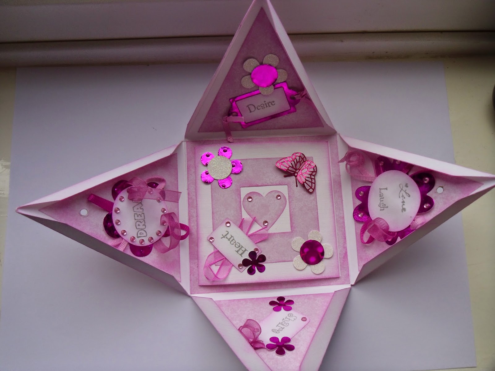
Close up by overlapping each quarter, tucking the last one in.....similar to how you would close a box up if you didn't want to completely seal it with tape.  It is important to decorate the front whilst it is closed, as the folding process can alter the position of margins.  I cropped my photos to 6 cms squares, and matted on complimentary coloured mats of 6.5 cms squares.  I positioned them approximately 1/4" from the two outer edges, thus having a frame all the way around when all four photos were placed.  You could use some or all of the squares for wording or numbers e.g 18th, 50th etc.

For the inside I used one large photo on a mat and placed it centrally.  I printed a verse and split it between the top and bottom sections, and used some scraps for a little bunting at the sides.  You could add more photos, especially if it is for a special birthday or anniversary.  Looking at how people have changed as years have passed can lead to a wealth of  chatter and amusement as memories are relived.


Have fun and more importantly...have a go.  Happy Crafting !!
Christine

Monday, 20 April 2015

PYRAMID BOX

Using a sheet of 12 x 12" card, score into 9 equal sections, by scoring at 4" and 8" intervals.  Then mark the mid point of each side and score up to this point, as shown in the diagram.  You will then need to measure and mark a 1 cm width around all these last diagonal score lines.  This will form your cutting line.  Taper the cuts at the top points to enable you to fold your box up without excess bulk.

The close, you will need a 9 cms square of card (or 2 glued together to give extra strength), with a centre section cut out, approximately 4 cm square. On two opposite triangular sides of the box, you will need to make a small hole, approximately 3.5 - 4 cms down from the top point, to enable you to slot a wooden kebab skewer through.  I did all my decorations before I made these holes.  I cut the skewer down to a length I felt was reasonable, with some overhang either side.  I sanded both ends so they wouldn't cause injury, and decorated one end with tied ribbons and beads, just to add interest.

The photos show how I have decorated mine.  I decided on a pink theme, but an ecclectic mix of colours would work equally as well.  The square used to hold the box closed also needs decorating, but avoid anything overhanging the cut out centre square, or it will cause an obstruction.

I'm not a huge 'peel off' fan, but sometimes they have a place.  The butterflies perfectly matched one of the metallic pink cards I had chosen to use for some of my flowers.  I attached them to the pale pink paper, and cut around them, then shaped their wings a little to give them dimension.  As I was using a pale pink paper on white card, I inked all the edges so the mats would 'pop' rather than simply blending into the background.  If you use strong contrasting           paper/card, you may find there is no need to ink. 

The box could be used to hold a gift, or, as I have done, hold a card in its base.

When you've had a go at this particular box, why not try different sized and shaped pyramids.  You still need to use the initial principle of 9 squares, but your first score lines to produce these 9 squares, will vary.  So for example, if you score at 5" and 7", you will have a taller box with a smaller base, or 3" and 9", a shorter box with a larger base.  As long as you score an equal distance from your mid point along each side, everything will fall into place.  Try an 8" or 6" square of card to produce even smaller boxes.

When I was in High School,  I had a brilliant maths teacher who had us making these around Christmas time, although the 1 cms flaps were completely glued up rather than using a skewer to secure.  We would make four pyramids and a cube for the centre, to stick these pyramids to, making fabulous star shaped Christmas ornaments. 

Have fun !
Christine.


Monday, 13 April 2015


 FANCY FOLDS 1
For this particular card I used a plain sheet of 12" square thin card.  If it is too thick you will find it hard to manipulate into position once all the folds have been made.

1.  Faintly mark the centre with a cross - this will help to ensure that the next folds are even widths.
2.  Score at 6" and 9", both ways.  Using the centre cross as a guide, fold in (lining up with the cross) and crease with your finger.   If you do too strong creases at this stage, you can't adjust if needed, later on.  Quarter turn and repeat.
3.   Undo all the folds, then fold all four corners to the centre cross.  Again, only crease with your finger.  These diagonal folds need to be folded back on themselves, in the other direction, to allow extra flexibility in stage 4.
4.  Open out and lay flat on it's base. In the middle of each side you will notice a point where these diagonals have just been formed.  Push inwards towards the centre from all four directions, to form a neat square.  This is where you can make slight adjustments, then sharpen all creases with a bone folder.  As an optional extra, you can fold the top squares back on themselves to form triangles.  Your basic card is now complete and just needs decorating.
5.  On this particular card, I decided to use a border punch around all the edges.  All folds must be made before you do this.  I did this by opening it out to a 12 " square again, and taking my time, punched a border.  I did play about with various border punches or scraps of paper, to make sure the pattern, and corner turning, worked out for this particular size.
6.  To close, I made a simple 'wrap' style belly band, fastening it with a little ribbon and added a topper to draw your eye to the centre.  It just awaits a verse appropriate for the intended recipient


This card has been made from a good weight double sided paper.  You will notice that the top squares have not been folded back on themselves, or the edges punched, as I only intended this to be 'an envelope' for the card inside.

Keep it as simple as you like, but have a go !!

Happy crafting everyone

Christine

Monday, 6 April 2015

Double Pocket Card


 This card can be made from any sized square or rectangle.  It is important to note that your finished card will be one quarter of the original size, and because of this I have not worked on anything less than an 8" square.  The one shown opposite is using a 12" square of patterned double sided.  If you are using a patterned paper, make sure it is not directional, otherwise when folded, it may appear the wrong way up !!  You can always use plain heavy paper or thin card, then line areas to give it interest.

Regardless of the size, or square/rectangle, begin by folding edge to edge in both directions, so you have four obvious quarters.  Make sure your folds have sharp creases, unless you are using a card stock that cracks easily.  But should it crack, sponge a little ink around the folded edges to give it an 'aged/distressed' look, as though you intended to do that all along.

In the first photo, you will see the top left corner folded down to within 1cm of the centre crease, and the bottom right folded up about half way up that bottom quarter.  Crease sharply then cut along the centre line from the right hand edge to the centre point.
To fold up, and to get a feel for the folding order...FOLD..
Bottom right over to the bottom left
Bottom left up to top right
Top left over to top right
This should now look like photo 2.  Because there is now bulk with the folds and creases, you may need to trim any slithers that overhang and thus retain a neat shape.

Stick down the diagonals and attach some border edges (photo 3)
Place tape in poisitions shown (photo 4), then seal up in the same order as that described above for folding up.

Your card should look similar to this.

Now all you have to do is decorate it.  Tags are perfect for the pockets.  They can provide a space to add a verse/sentiment, or photographs and perhaps some journalling to make a truly unique and personal card.


I added a ruby and a cream tag into the two front pockets and decided to stamp and emboss 'verses' onto each.


 I then used a third tag for my mat in the centre.  I kept this quite simple as the paper I used (First Edition Noir et Chic) was quite busy.


 This example is using an A4 piece of paper.  I did the fold and cuts from a 'portrait' perspective, but there is nothing to stop you from doing it landscape.


This is another 12" square, but was only single sided.  I lined the back pocket with a pink check paper, and the inside with yellow card to give it added strength.


 Happy Crafting !!!

Monday, 30 March 2015

RESIST TECHNIQUE - PART 2


Following on from last week, and those of you who know me, know I love playing and getting messy....what better way than using spray dye inks !!  It is the same technique where you stamp an image using VersaMark and heat emboss using clear/white embossing powder to form your 'resist' area.  Instead of using dye based ink pads, try sprays.  *I cover my work area with a plastic table cloth kept for 'messy' creative fun. For the tag, I mopped up any residual spray from my tablecloth, onto a spare piece of card.  I then stamped a large flower stamp several times and cut a couple out, cutting into the petals, towards the centre to allow me to pull it in, shaping and giving dimension to the flower.  I then added a few embellishments and some jute to give it further texture and dimension.


For the card, I used a blue and a yellow spray, predominantly mixing to a green, but still with hints of the initial two colours.  As spray inks are much wetter, and as you are unable to dry them off with a heat tool otherwise you will melt the 'resist', you have a couple of options at this stage, before you lift the 'resist' off with an iron. Either roll kitchen tissue over to remove the excess (this can leave a pitted texture which you will either love or hate), or using another clean piece of card, place it over the top and rub lightly....another way of mopping up the excess,and another surface prepared for a future creation.  Alternatively you could be patient and leave it to air dry....PATIENCE is not one of my virtues unfortunately !!!!  I kept this card very simple and just used one of the fabulous Kaisercraft clear texture stamps (Postmarks) to over stamp. The greeting is stamped onto some of the waste that I trimmed off when mounting the main image.  A little ribbon and double matted...Voila !


Monday, 23 March 2015

RESIST TECHNIQUE


This is one of my favourite techniques !!!

Firstly, you need to create an image to resist the colour of the next layer.  In the tag opposite, I used a word quote stamp.  To create the 'resist' use a clear embossing ink e.g. Versamark, stamp your image and cover with either clear or white embossing powder.  Remove the excess, then heat set the powder. After a moment or two, when cool, add your choice of colours.  For this particular tag I used Tim Holtz distress ink pads- Peacock Feathers, Scattered Straw, and lightly edged with Vintage Photo.

You now need to lift off your 'resist' element, so that you can build further layers.  To do this use a hot, dry iron (make sure the steam is switched off), and place a clean piece of white printer paper over the top.  Press firmly onto the image for a minute or two.  You will see your image melting and being soaked up by the paper.  Lift and check to see if you have removed all the embossing powder by carefully (because it will be hot) running your finger over it, to see if any of the image is still raised.  If you can still feel some of the 'resist', place some more clean paper over the image and repeat the iron process, until all of the initial image has been removed and it is your base card colour that appears where your coloured inks have resisted them.  Tip: take care that only clean paper touches the image when ironing, or residue will transfer back and spoil your creation.

For the next layer I inked a flower stamp in black, to create a bolder contrast.  I also embossed with black powder, but this is optional.  It does however make it much more tactile....and we all tend to look with our hands rather than our eyes as we were so often reminded not to do when we were children !!!  I also added touches of an ultra fine crystal glitter by DecoArt to give it sparkle and dimension, accented with Card Candi, a metal decorative corner and a piece of black satin edged ribbon and was pleased with my 'minimal' effort.  What took very little time, gives the impression that a great deal of work has gone into it...


Both of these cards were created in exactly the same way .... what a difference choice of colours can make !!  For both the resist and the main image, the same stamp was used, but  slightly offset to the left.  Also, I didn't emboss this image in black.  Instead, I opted to stamp and emboss a verse on the front, which would only work over a flat image.

So...what are you waiting for....have some fun. If you have any questions, email me at contact@divinecrafting.co.uk, and don't forget to email photos of your creations too.

Christine x

Monday, 16 March 2015

Inky Layers

I have so many ideas I want to share with you all, but where do I begin ?

Any techniques I  do share may cross over to different surfaces or art styles, so don't be limited, even if I have only used a tag as an example.  Think about using these techniques in your card making, art journaling and scrapbooking.  Perhaps produce a canvas or a piece of altered art work.  If some of this seems new and you're not sure what planet I am on, then keep stopping by and hopefully I can share my knowledge so that you may further your creative repertoire.

This week I thought I might start with some basic inking to create layers.  There are many types of ink on the market, all of which have different qualities, suitable for a variety of purposes.  I will at a later date blog about inks, for those that are a little unsure. 

A heat resistant craft mat is an ideal work surface as it's slick coating allows your blending foam to slide onto your card much more easily.  If you haven't got one, an oven liner (they tend to be a black version) or the back of your craft mat will be fine.  For the purpose of this technique I used dye based inks (Ranger Distress inks).  Use whatever you already have in your crafty stash, there's no need to rush out and start making hefty purchases....even though we crafters love nothing more !!!  Decide first whether they are techniques you wish to explore further.  

Firstly select 3 colours: one each of a light, medium and slightly darker ink, to give you some contrast. I chose a pale lemon, a light orange and a red. Using foam to pick up the colour from your ink pad (I prefer Ranger Cut 'n' Dry - a small square for each individual colour can be used over and over again), and starting with your palest colour, using a light circular motion from your mat and onto your card, start applying the colour.  If you do this lightly until you get a 'feel' of the motion, you can always add more colour, but you can't take it away if you go in too heavy handed.  I generally apply my first colour to the top right, bottom right, then the middle of the left side. Now the psychology bit......this rule of 3 is the most aesthetically appealing combination to the human mind....but that's the limit of my knowledge on that subject ! 
Then onto your medium colour, filling in some of the empty spaces, and finally your darker colour, which should be in smaller patches to accent .  You will notice from mine, these naturally fall in the opposite areas to the palest colour: middle of right side, bottom left and top left..

Now to start creating your layers.  I used a stencil of a clock, but it doesn't matter what it is, you are only adding some interest, and you can't tell that I used a clock, even if you look very closely.  I made a disposable one, die cutting an oddment of card, and placed it so it fell over the bulk of the lightest areas.  Either using the medium colour ink, or, as I did a pale brown (as this fitted with the warm tones of my colour palette....gosh another blog topic idea), very lightly start adding a little depth of colour.  This is subtle as you don't want to completely cover your initial colours, think of it as 'adding shading'.  If your stencil moves, you could use low tack tape to secure, but be careful not to 'shade' over the tape or that will leave a 'ghost image' too !! **tip for low tack tape - remove some of the sticky by touching to your skin or clothing a few times first, this prevents it over sticking to your card and tearing it when the tape is removed.  I then added further layers, using the same pale brown/medium ink colour and partial impressions of stamps.  Direct stamping ink colour will always be a deeper shade than that which has been blended...unless you really have been too heavy handed....whoops!!  I used a postmark stamp, but I could have equally used a flower, script etc., use whatever you have already.   If you notice, I have intentionally stamped off the edges.  This again helps with the depth, giving the illusion that it is fading away. The main image was then stamped in a darker ink that totally contrasted with the other colours - navy blue.  The stamp I used was a steampunk butterfly by Chocolate Baroque.  I fell in love with this stamp as soon as they released it....so you may see it popping up frequently.  You could add a sentiment or a phrase - if you haven't got anything suitable, why not simply write something on it. To finish, and add a few more layers, I added some accents - watch parts that I once bought in a bulk bag and have been sitting waiting to be used for such a long time, a metal cog, and I cut out a butterfly from a paper pad I had, covered the centre clock face with crackle accents (Ranger), and when dry, attached with a curly paper clip.  Instead of ribbon I used a paper/tissue roll - not entirely sure what it is called but something I have had for such a long time and was yelling out to be used.

Once you've 'had a go', don't limit yourself to a tag, although this, or a square, rectangle etc. matted and added to a card would be fabulous, why not have a go at art journaling, it's very therapeutic.  I will no doubt, visit this fabulous creative area many times and suggest links to help you further.

Thank you for stopping by, hopefully you will find this of interest.  In the meantime, don't be shy, send me photos of your work (contact@divinecrafting.co.uk) so I can add it to my inspiration page on www.divinecrafting.co.uk  

Christine x