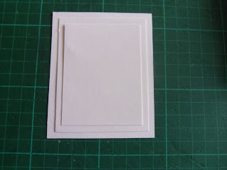
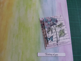
 Begin by choosing a large stamp that is very busy. A picture/scene stamp would work equally as well. I chose a beautiful hydrangea by Inkadinkado, that has a script background as part of it's feature. I chose to use Memento ink as it doesn't bleed if you use inks/pens ...although you will see later on, that I changed my mind on how I would colour the image. You will need to cut three pieces of thin card (thin, otherwise the image won't transfer to all the layers if there is too much card depth). The largest should be approximately the size of your stamped image - you may need to stamp one out onto some scrap paper and cut it down to find the best size. If anything, it is better for this to be slightly smaller than slightly larger, otherwise you will lose some of the image on your bottom layer. Stamping off the edges always creates further interest. The other two layers are graduated down. I cut mine 1 cm (middle layer) and 2 cms (upper layer) smaller than the original eg:
9.5 x 7.5
8.5 x 6.5
7.5 x 5.5
If you are in the USA, 3/8" difference would be suitable.
 Carefully stack all of the layers, so that they lay straight. Unfortunately you cannot tape them in place, unless you have some void space in the corners of your stamp - but that would kind of defeat the object of the exercise.
 Ink and stamp your image, pressing down firmly so that the impression transfers to the lower layers. Here is what it should look like when separated.

Now, as I mentioned earlier, I changed my mind on the colouring medium.......as you do !!!! The trouble was, I went into my craft room for inks, and spied several tins of chalks which I haven't used in eons. I blended the chalks onto the appropriate areas of the image, then stacked them back up again.
 I then went back to the craft room (I can't actually get into it to craft !!), to select some paper than would go with the soft, muted chalk colours. Those of you who know me may need to sit down as you might faint with shock. The perfect papers, which I knew instantly, were some I bought well over a decade ago, and have until now, remained in my 'to look at and ogle and occasionally stroke' stash. Yes....when you have a thing for paper, there are just some papers you cannot bring yourself to cut into.....I know there are many of you crafters who know exactly what I mean. My friend Ann used to think I was strange, until she overheard several other crafters at a show saying they were purchasing two of each paper so they always had one to look at and stroke. Ann has now become a convert :)
The layers are stacked using 3D foam pads, then I mounted my stacked images, the backing paper and the sentiment onto a grey card because it was softer and worked better with the muted tones. I also finished the sentiment off with a couple of punched dots (using a 1/4" plier punch), as I didn't like the expanse of white card at either side of the wording, but wanted it to stay the same width as my image, so the card would look balanced. So come on, get to it !!
Happy crafting everyone,
Christine


No comments:
Post a Comment