I am frequently asked to teach this technique, and I have to admit, it is one of my favourites.
This time, I decided to show you some comparisons between different colouring mediums - mainly to demonstrate that you can use whatever you have got in your craft stash.
 You will however, need a clear embossing pad e.g. Versamark or Perfect Medium, either a clear or a white embossing powder, and a heat tool. A hairdryer will not work as it will blow the powder away. A heatgun (the type for burning paint off wood) will work, but be careful not to scorch your card.
You will also need some busy background stamps.... which you might have to make several impressions, to cover the area. The one on the left (and above) are the Kaisercraft Texture stamps and are very inexpensive.
You will however, need a clear embossing pad e.g. Versamark or Perfect Medium, either a clear or a white embossing powder, and a heat tool. A hairdryer will not work as it will blow the powder away. A heatgun (the type for burning paint off wood) will work, but be careful not to scorch your card.
You will also need some busy background stamps.... which you might have to make several impressions, to cover the area. The one on the left (and above) are the Kaisercraft Texture stamps and are very inexpensive.
 I made my tags from some rectangles of card. This first example uses Distress inks (as I have shown you in the past). You could use pigment inks (sponge pads) if you don't have the Distress ones, but be careful that you don't add too much all in one go, otherwise you will get lines and streaks where you don't want them, that won't blend, however hard you try. It is much better to gradually build up your depth of colour.
So this one is using Distress inks - Barn door, Spiced Marmalade and Mustard Seed.
I made my tags from some rectangles of card. This first example uses Distress inks (as I have shown you in the past). You could use pigment inks (sponge pads) if you don't have the Distress ones, but be careful that you don't add too much all in one go, otherwise you will get lines and streaks where you don't want them, that won't blend, however hard you try. It is much better to gradually build up your depth of colour.
So this one is using Distress inks - Barn door, Spiced Marmalade and Mustard Seed.
 And for this one, I brushed on some Starburst Stains. I have had these for an eternity and haven't used them in years. But as I have said, give whatever you've got a try....nothing to lose by experimenting. These stains are a mixture of water, mica pigment and a dye. You could have a go at mixing your own up.
Here is what it looks like when the stains have been brushed on.

 I also applied acrylics to another tag, using a small amount on a baby wipe, and blending it in.
And for the fourth example, I used spray inks.
When the ink/medium has dried, you will need a clean piece of copier (printer) paper and a hot, dry iron. If you have a steam function, set it to no steam and the hottest heat setting.
I also applied acrylics to another tag, using a small amount on a baby wipe, and blending it in.
And for the fourth example, I used spray inks.
When the ink/medium has dried, you will need a clean piece of copier (printer) paper and a hot, dry iron. If you have a steam function, set it to no steam and the hottest heat setting.
 Place the clean paper over the tag and press down with the iron for a few seconds. If you lift the iron up, you will probably see the embossed image showing through the copier paper. If you can see the whole image, you will have lifted all the embossing off - which is what we are aiming for. If you are using thicker paper, you might have to check the surface of the paper that was touching the tag. If you need to repeat this process, even for a small area where you may have missed, always use a clean piece of paper.....or you might transfer what you've lifted off and mess up your iron.
So....where the embossing powder was, is the area that has resisted the addition of colour, thus remaining in the base white.
I finished this by over stamping in black and embossing a quote in copper. There is scope to embellish further, when I make it into a card.
Place the clean paper over the tag and press down with the iron for a few seconds. If you lift the iron up, you will probably see the embossed image showing through the copier paper. If you can see the whole image, you will have lifted all the embossing off - which is what we are aiming for. If you are using thicker paper, you might have to check the surface of the paper that was touching the tag. If you need to repeat this process, even for a small area where you may have missed, always use a clean piece of paper.....or you might transfer what you've lifted off and mess up your iron.
So....where the embossing powder was, is the area that has resisted the addition of colour, thus remaining in the base white.
I finished this by over stamping in black and embossing a quote in copper. There is scope to embellish further, when I make it into a card.
 Again, I over stamped in black, and a dark green for the flying birds, then embossed some keys in silver. The photo doesn't capture the beautiful shimmering lustre of the mica.
 I stamped some 'foliage' at the bootom in a navy ink, some smaller bubbles in a cerise ink, then stamped and embossed a verse in silver.
And finally... I added some Lavinia stamps in black ink, then embossed a gold fairy and "Fairy Wishes and Angel Kisses"
I stamped some 'foliage' at the bootom in a navy ink, some smaller bubbles in a cerise ink, then stamped and embossed a verse in silver.
And finally... I added some Lavinia stamps in black ink, then embossed a gold fairy and "Fairy Wishes and Angel Kisses"
So start experimenting.....and don't forget to send me photos.
Christine
 This is a really easy technique and you can achieve some stunning results.
Begin by stamping a background texture stamp all over your piece of card, and immediately cover it with clear embossing powder and set with a heat tool. I used Distress ink - Broken China. These inks, whilst a dye base, do have a unique quality where they will remain wet for a little while, and capture the embossing powder. You could use a pigment ink as an alternative (these tend to be a sponge based pads).
Then, blend in a contrasting colour onto the white areas and immediately cover everything in clear embossing powder and set with a heat tool. I used Distress ink - Wild Honey.
 It is done in this manner, because if you just stamped the 'blue' then blended the remainder with honey, then added embossing powder, the blue would certainly have dried, it wouldn't capture any embossing powder and you wouldn't achieve an all over shiny enamelled effect. So by doing it in 2 stages (you could add more layers if you wish), the
blue naturally creates a resist to the honey ink, once it has been embossed.
It is done in this manner, because if you just stamped the 'blue' then blended the remainder with honey, then added embossing powder, the blue would certainly have dried, it wouldn't capture any embossing powder and you wouldn't achieve an all over shiny enamelled effect. So by doing it in 2 stages (you could add more layers if you wish), the
blue naturally creates a resist to the honey ink, once it has been embossed.
I then used Distress -Tea Dye - all over, to highlight areas and edge the card.
Simple matting onto coordinating card colours, a sentiment and a few embellishments finish off what has been a fairly quick card to make.
Christine
 This is such a simple card, but I'm sure you will agree, an effective one.
 Begin by selecting a large stamp, the bigger the better. I've used a background stamp, but have on many occasions used the larger House Mouse stamps (there are occasionally some squares/rectangles which don't capture any of the image, but that really doesn't matter). Also, I have simply stamped in a coloured ink, but don't let this be your limit. A beautifully coloured scene, or even a background created for example, by splatters of inks, and then cut up, are effectively stunning.
Trim all of the excess, and also any extra to make it easily divisible. Now, now !!! Don't get in a panic at the thought of fractions from your time at school. As long as you can divide the measurements by 3, on both sides, you will be fine. Mine measured 12.5 x 9.5 cms, so I trimmed a little more to make it 12 x 9, which both 12 and 9 can be divided by 3.
Begin by selecting a large stamp, the bigger the better. I've used a background stamp, but have on many occasions used the larger House Mouse stamps (there are occasionally some squares/rectangles which don't capture any of the image, but that really doesn't matter). Also, I have simply stamped in a coloured ink, but don't let this be your limit. A beautifully coloured scene, or even a background created for example, by splatters of inks, and then cut up, are effectively stunning.
Trim all of the excess, and also any extra to make it easily divisible. Now, now !!! Don't get in a panic at the thought of fractions from your time at school. As long as you can divide the measurements by 3, on both sides, you will be fine. Mine measured 12.5 x 9.5 cms, so I trimmed a little more to make it 12 x 9, which both 12 and 9 can be divided by 3.
 So, when cut up, my 9 rectangles measure 4 x 3 cms. IT IS IMPORTANT THAT WHEN YOU ARE CUTTING THE SQUARES/ RECTANGLES, YOU KEEP THEM IN THE SAME ORDER otherwise you might have a bit of a jigsaw to solve.
Keeping them in the same order, stick then onto a piece of complimentary coloured card, making sure you leave the same gap width all around the edge and between the pieces.
Trim as necessary and mount onto your base card. Embellish and decorate as you wish.
Christine
So, when cut up, my 9 rectangles measure 4 x 3 cms. IT IS IMPORTANT THAT WHEN YOU ARE CUTTING THE SQUARES/ RECTANGLES, YOU KEEP THEM IN THE SAME ORDER otherwise you might have a bit of a jigsaw to solve.
Keeping them in the same order, stick then onto a piece of complimentary coloured card, making sure you leave the same gap width all around the edge and between the pieces.
Trim as necessary and mount onto your base card. Embellish and decorate as you wish.
Christine
I stumbled across this on Pinterest the other day, and whilst I have done something similar in the past, I hadn't ever given it a name.....although that in itself is blatantly obvious ..... I am blonde though !!!!
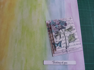
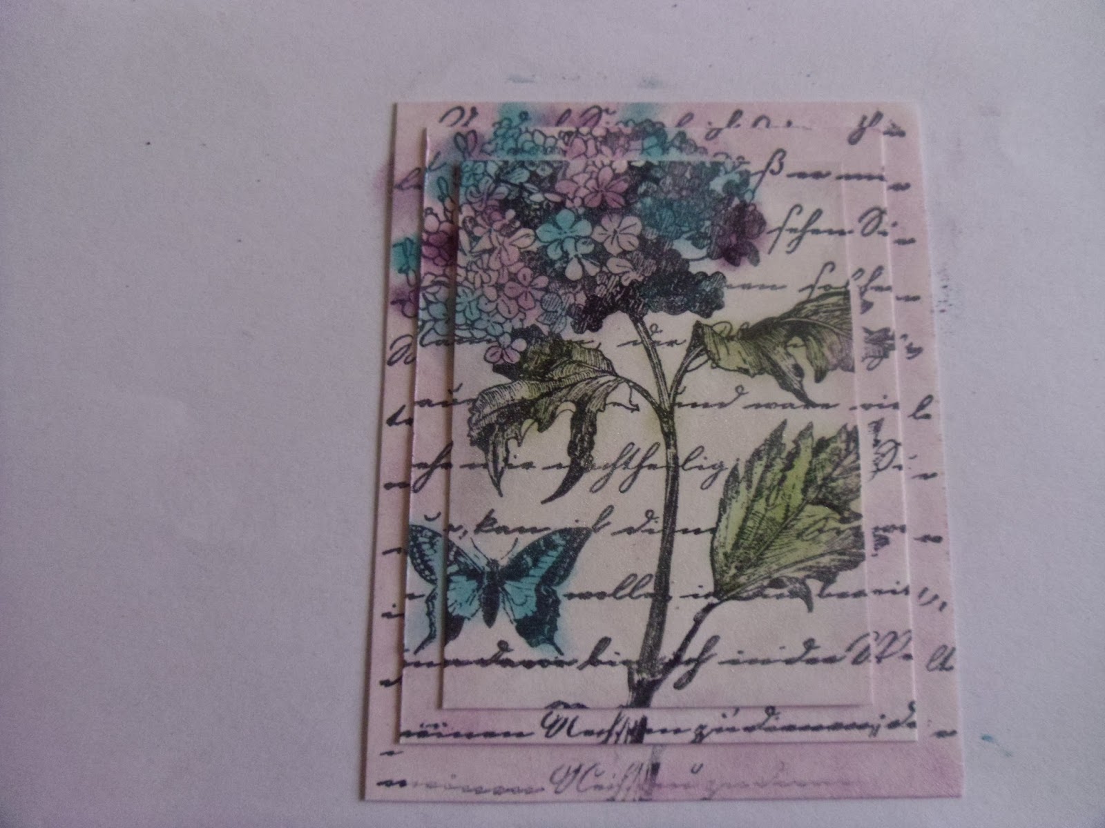
 Begin by choosing a large stamp that is very busy. A picture/scene stamp would work equally as well. I chose a beautiful hydrangea by Inkadinkado, that has a script background as part of it's feature. I chose to use Memento ink as it doesn't bleed if you use inks/pens ...although you will see later on, that I changed my mind on how I would colour the image. You will need to cut three pieces of thin card (thin, otherwise the image won't transfer to all the layers if there is too much card depth). The largest should be approximately the size of your stamped image - you may need to stamp one out onto some scrap paper and cut it down to find the best size. If anything, it is better for this to be slightly smaller than slightly larger, otherwise you will lose some of the image on your bottom layer. Stamping off the edges always creates further interest. The other two layers are graduated down. I cut mine 1 cm (middle layer) and 2 cms (upper layer) smaller than the original eg:
9.5 x 7.5
8.5 x 6.5
7.5 x 5.5
If you are in the USA, 3/8" difference would be suitable.
Begin by choosing a large stamp that is very busy. A picture/scene stamp would work equally as well. I chose a beautiful hydrangea by Inkadinkado, that has a script background as part of it's feature. I chose to use Memento ink as it doesn't bleed if you use inks/pens ...although you will see later on, that I changed my mind on how I would colour the image. You will need to cut three pieces of thin card (thin, otherwise the image won't transfer to all the layers if there is too much card depth). The largest should be approximately the size of your stamped image - you may need to stamp one out onto some scrap paper and cut it down to find the best size. If anything, it is better for this to be slightly smaller than slightly larger, otherwise you will lose some of the image on your bottom layer. Stamping off the edges always creates further interest. The other two layers are graduated down. I cut mine 1 cm (middle layer) and 2 cms (upper layer) smaller than the original eg:
9.5 x 7.5
8.5 x 6.5
7.5 x 5.5
If you are in the USA, 3/8" difference would be suitable.
 Carefully stack all of the layers, so that they lay straight. Unfortunately you cannot tape them in place, unless you have some void space in the corners of your stamp - but that would kind of defeat the object of the exercise.
Ink and stamp your image, pressing down firmly so that the impression transfers to the lower layers. Here is what it should look like when separated.
Carefully stack all of the layers, so that they lay straight. Unfortunately you cannot tape them in place, unless you have some void space in the corners of your stamp - but that would kind of defeat the object of the exercise.
Ink and stamp your image, pressing down firmly so that the impression transfers to the lower layers. Here is what it should look like when separated.
 Now, as I mentioned earlier, I changed my mind on the colouring medium.......as you do !!!! The trouble was, I went into my craft room for inks, and spied several tins of chalks which I haven't used in eons. I blended the chalks onto the appropriate areas of the image, then stacked them back up again.
 I then went back to the craft room (I can't actually get into it to craft !!), to select some paper than would go with the soft, muted chalk colours. Those of you who know me may need to sit down as you might faint with shock. The perfect papers, which I knew instantly, were some I bought well over a decade ago, and have until now, remained in my 'to look at and ogle and occasionally stroke' stash. Yes....when you have a thing for paper, there are just some papers you cannot bring yourself to cut into.....I know there are many of you crafters who know exactly what I mean. My friend Ann used to think I was strange, until she overheard several other crafters at a show saying they were purchasing two of each paper so they always had one to look at and stroke. Ann has now become a convert :)
The layers are stacked using 3D foam pads, then I mounted my stacked images, the backing paper and the sentiment onto a grey card because it was softer and worked better with the muted tones. I also finished the sentiment off with a couple of punched dots (using a 1/4" plier punch), as I didn't like the expanse of white card at either side of the wording, but wanted it to stay the same width as my image, so the card would look balanced. So come on, get to it !!
Happy crafting everyone,
Christine
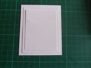
I seem to have a few 50th birthday's coming up, so I decided to make this framed card and share it with you. I first made these style of cards a few years ago, and I cannot remember where the idea came from, but it isn't mine.
For the frame:
Cut an 18 cms square piece of card and from the outer edge working towards the centre, score at 1 cms; 2 cms; 3.5 cms; 4.5 cms & 6 cms. Repeat for all four sides.
The blocked red sections marked on the diagram to the left are the sections to be removed, and the additional red lines are CUT lines. You will also notice in the lower right corner, I have marked (in black) further diagonal cuts that make the tabs to hold the frame. This should be done for all four corners.
When you have removed the specified sections, made the additional cut lines and sharpened all your score lines, you should have something that looks like the photo on the left.
When you fasten it into the 'frame' shape, it should look something like this underneath.
And like this on the upper surface.
The base card is approximately a 15 cms/6 inch square. I cut a 15 cms square mat for the front of the card; a 15 cms square frame that is 1.5 cms deep (keep the cut out), and some 1 cms strips to cover the frame edges, both inside and out.
This is when the papers have been fixed to cover the frame.

And the front of the card waiting for the focal point and frame adding.
I also added the smaller square off cut from the centre of the frame above....waste nothing.
And to complete, I added a decoupaged figure, 50, a few corners and a greeting. Edges can be inked if you wish, or run the chisel edge of a ProMarker (or similar) around the frame, to disguise gaps if you have them.
Christine
I thought I would share an Easter card with you this week, and re visit inking. This uses limited resources and is achievable by everyone.
 I began by 'masking off the edges and at the same time, securing my base card to my work mat to stop it moving about when I am applying pressure when adding the ink. I used masking tape, but because this is quite tacky, I always press it to my clothing (or skin) several times, to make it more of a low tack tape.
You will notice I have only allowed the tape to cover approximately 1 cm of the card's outer edge. I also punched a circle of card (to represent the sunlight) and added a little masking tape underneath, to hold it in position.
I began by 'masking off the edges and at the same time, securing my base card to my work mat to stop it moving about when I am applying pressure when adding the ink. I used masking tape, but because this is quite tacky, I always press it to my clothing (or skin) several times, to make it more of a low tack tape.
You will notice I have only allowed the tape to cover approximately 1 cm of the card's outer edge. I also punched a circle of card (to represent the sunlight) and added a little masking tape underneath, to hold it in position.
 ....and more tape. This is to give me a horizon line, to separate the land and the sky.

 I inked my sky first. I used distress ink - Tumbled Glass. Distress inks are fabulous blending inks. They are a water based dye ink. When I pick up ink from the ink pad onto my foam applicator tool, I dab it off onto a piece of plastic, so that the colour is not initially too strong. You can always add more, but you can't take it away !!. I swirl lightly at first, and when you get this swirling action going, you can then add more pressure to deepen the shade. Some crafters like to angle their applicator tool, and work from a craft mat and gradually onto their work. You will have to experiment as to what suits you best.
I carefully removed the 'horizon' masking tape (you can just about see the blue) ...
I inked my sky first. I used distress ink - Tumbled Glass. Distress inks are fabulous blending inks. They are a water based dye ink. When I pick up ink from the ink pad onto my foam applicator tool, I dab it off onto a piece of plastic, so that the colour is not initially too strong. You can always add more, but you can't take it away !!. I swirl lightly at first, and when you get this swirling action going, you can then add more pressure to deepen the shade. Some crafters like to angle their applicator tool, and work from a craft mat and gradually onto their work. You will have to experiment as to what suits you best.
I carefully removed the 'horizon' masking tape (you can just about see the blue) ...
......and re applied, covering the edge of the blue, butting up to the line created by the blue ink. I then applied a yellow ink (fossalized amber), removed the tape again, and applied a light touch of the yellow around the upper part of the circle mask.
I
continued, applying crushed olive to the lower part, and blending it
into the fossalized amber, so the two colours seamlessly blended
together.
 This is how it looks when the circle mask had been carefully removed.
I carefully removed all the other masking tape, peeling it back slowly so that it did not tear my card. I then stamped a spray of seed heads, but it could be flowers, and an Easter greeting.
You have a little time to still make some Easter cards....so get cracking !!!! (...so glad I didn't put an egg on the front, you would have thought I was being funny ha ha)
Christine
This is how it looks when the circle mask had been carefully removed.
I carefully removed all the other masking tape, peeling it back slowly so that it did not tear my card. I then stamped a spray of seed heads, but it could be flowers, and an Easter greeting.
You have a little time to still make some Easter cards....so get cracking !!!! (...so glad I didn't put an egg on the front, you would have thought I was being funny ha ha)
Christine
As it was Mothering Sunday yesterday, I thought I ought to get my act together. Although I confess, I had already bought cards for our mums....I know - naughty me !!! ..... but I also had a craft fair on Saturday and thought I ought to add a few to my eclectic mix of altered art and home decor goodies for sale.
I have been so busy lately, so I apologise that this is not a tutorial style blog, but more of a revisiting of the collage blogs from a few weeks ago.
The papers and stamps used are from Lili of the Valley. I simply mixed and overlapped papers , some were matted onto complimentary card, along with die cuts for the sign and bracket in the same card. I decided to stick to a purple and aqua colour palette, and when I came to colouring my stamped image, I used ProMarkers that fitted within this range. A few pearls and a little chiffon organza and Voila - a simple but stunning card (even if I do say so myself), fit for any mum, who of course is wonderful and very deserving of being spoiled
Hopefully I will have an Easter card to show next week....and I hate to mention it, but I already have Christmas in mind.
Christine

 You will however, need a clear embossing pad e.g. Versamark or Perfect Medium, either a clear or a white embossing powder, and a heat tool. A hairdryer will not work as it will blow the powder away. A heatgun (the type for burning paint off wood) will work, but be careful not to scorch your card.


 Place the clean paper over the tag and press down with the iron for a few seconds. If you lift the iron up, you will probably see the embossed image showing through the copier paper. If you can see the whole image, you will have lifted all the embossing off - which is what we are aiming for. If you are using thicker paper, you might have to check the surface of the paper that was touching the tag. If you need to repeat this process, even for a small area where you may have missed, always use a clean piece of paper.....or you might transfer what you've lifted off and mess up your iron.


